My favourite Net-A-Porter colour is black.
(I like it so much I made a poster)
My favourite Net-A-Porter colour is black.
(I like it so much I made a poster)
Maybe you like something more striking. Red?
Designers like Missoni know how to make beautiful combinations of colours.
I'm a software developer in Net-A-Porter's Catalogue Management team. We worry about classification, filtering and ranking. On this page you're not seeing products filtered by colour, but products ordered by their similarity to a palette.
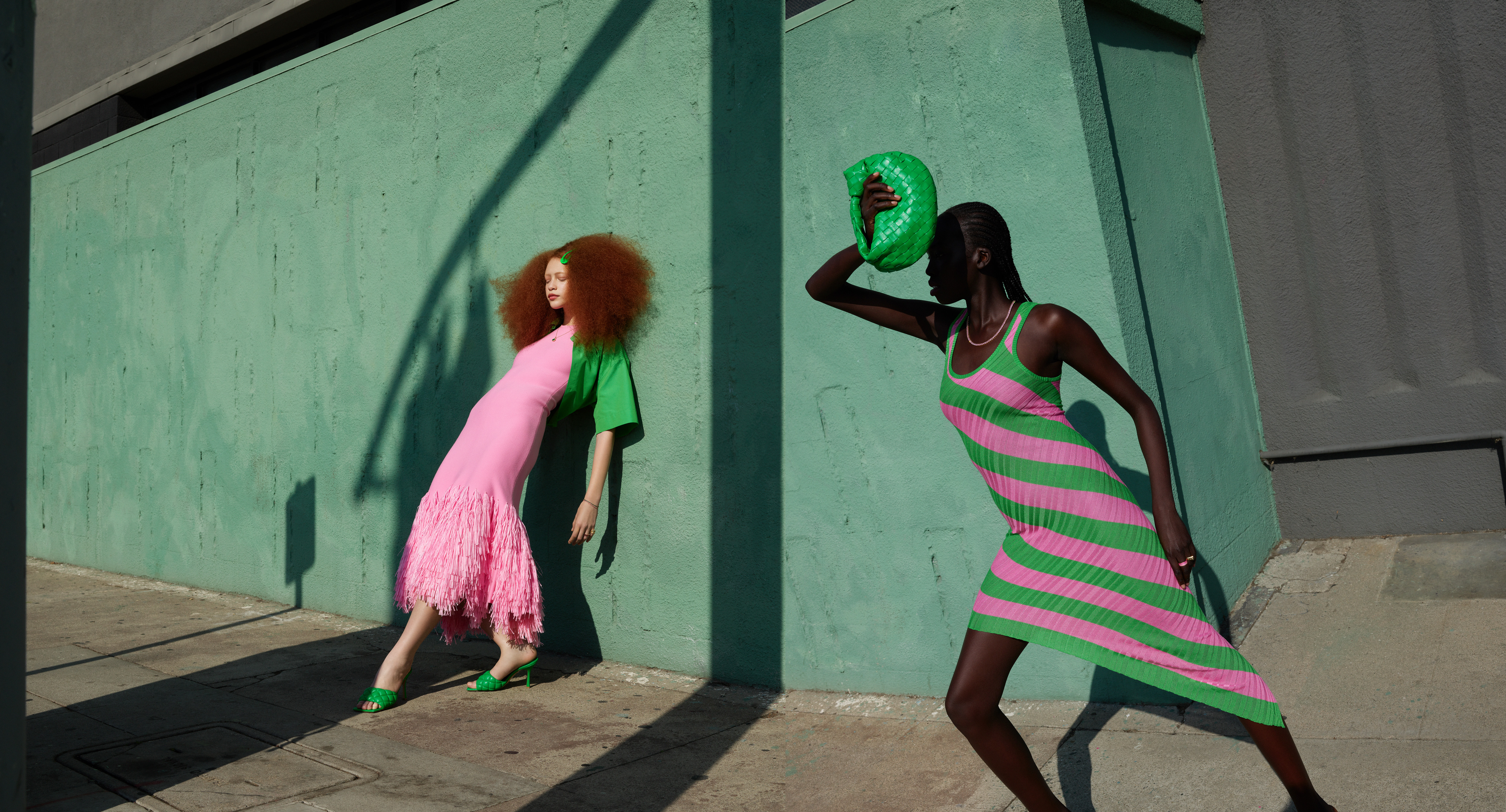
Net-A-Porter's Spring Summer 2022 marketing campaign, "Go for Bold", centred around a collection of colourful products. The campaign photography (which I love) used dramatic angles, shadows and vivid palettes. Marketing wanted to add a technology element to the project and one idea was to use palettes as a route to finding products.

Ultimately this idea was binned for something else, but Kris and Naz from our Future Strategy and Design team had already discussed how we might do this with Google, who had done something similar with Art Palette. I was too attached to the idea and what Google had done to not build it anyway.
The starting point was to identify a colour palette for every product. I used ColorThief to sample product images and extract the five most dominant colours from each. These colours would define a product's palette.
I needed to score how similar any two palettes were. A colour is a point in 3D space made up of Red, Green and Blue (RGB) coordinates. A Euclidean distance measures how close any two points in that 3D space are. Unfortunately, proximity in RGB is not a good proxy for how our eyes and brains perceive colour similarity. An alternative to RGB is CIELAB which was designed to represent colour in a way that more closely aligns with human perception. Euclidean distances between CIELAB colours do provide a good proxy for perceived colour similarity.
With five CIELAB colours per palette, measuring the distance between any two palettes (ignoring the order of colours) would mean 25 distance calculations. Not practical in a realtime query. For a catalogue the size of Net-A-Porter it would mean executing over a million calculations to find the closest palettes.
This is where I leant heavily on what Google had done with a clever optimisation trick. Offline, Goolge had calculated the distance between every possible palette in the colour space. Those distance values were then used to train a machine learning model to predict how similar any two palettes were. Removing the final layer in that model provided embeddings that represented the palettes in an n-dimensional space. Significantly, that space would locate similar palettes near to each other. These embeddings could be used to measure the distance between palettes directly, replacing 25 calculations with one.
The final step was to create an index of palette embeddings for the catalogue. An index provides a fast way to search for the nearest neighbours of any palette and to the products represented by those palettes. I used Jon Chamber's Vantage Point Tree implementation as an in-memory index.
What makes this fun is that with an index of embeddings and a way of converting a palette to an embedding it's possible to search for products that are the nearest neighbour to any palette. There's no reason a palette needs to come from a product image.
Maybe you want to find products that have a Starry Night palette?
Hello. I don't work at Net-A-Porter any more (I miss you all!). The APIs I used will likely change in future, so I've updated this to work offline. The product selection is now permanently fixed from January 2024.
I've collected fashion and portrait pictures for years. I've got thousands. I have a good sense of what I like but what if I organise them by colour palette and model?
My favourite things at the Louvre Abu Dhabi were Cy Twombly's Untitled I-IX paintings. They're structured but chaotic and beautifully imperfect.
What does a day's trading at Net-A-Porter look like? Taking inspiration from Formula 1's use of flow-vis paint, I came up with a visualisation for a YNAP hackday.
The most significant colours sampled from the product images of the top 1024 clothing products on Net-A-Porter, organised by hue.
Spotify's Wrapped is very shareable but what if it took a longer term view? What if it considered the full thirteen years I've been with Spotify?
Net-A-Porter's Spring Summer 2022 marketing campaign, "Go for Bold", centred around a collection of colourful products. Marketing wanted to add a technology element and one idea was to use palettes as a route to finding products. Ultimately this was binned, but I built it anyway.
That Roger Federer does not sweat had become ingrained thinking, the sort of idea we were looking to challenge. Was it real or just a lazy cliche? We had IBM’s Wimbledon match data for all the top players and using Weather Underground we pulled in temperature data for those matches. This let us see the number of matches played by player and temperature.
As an experiment in using the Physical Web I wanted to create a voting system for physical meetings. A meeting would have a current question and attendees could vote with one click. There would be no entering URLs, downloading apps, or scanning QR codes.
I'm Darren Shaw. I'm a software developer at Autotrader. Previously I worked at Zopa, Net-A-Porter and IBM. These are my side projects. Away from work I also play at being a portrait photographer.